How much time do you have before your website visitors get bored and leave?
There are a lot of sources that say it’s anywhere from 15 seconds to seven or less.
Regardless of the numbers, they all point to the same conclusion: you need awesome landing pages to keep your visitors’ attention and captivate their minds (and wallets, while you’re at it).
Landing pages aren’t quite the same as your average webpage. They’re more targeted and more action-oriented. They’re here to get you some conversions.
For this reason, they need to be hyper-focused on what you’re trying to accomplish.
In this article, we’re going to look at what makes a good landing page. Then, we’ll zoom in on 7 landing page examples so you can glean some insights for your own campaigns.
Let’s do this.
Post Contents


What Makes a Good Landing Page?
→ Click Here to Launch Your Online Business with Shopify
Before we get into what makes a good landing page, let’s quickly overview what a landing page is and how it’s different from other pages on your website.
A landing page is a stand-alone page that’s designed to accomplish one specific goal – like signing up for your email list, registering for your VIP program, or buying an item.
Typically, brands guide web visitors to a landing page through a specific campaign, like a Google or Facebook ad or an email marketing offer.
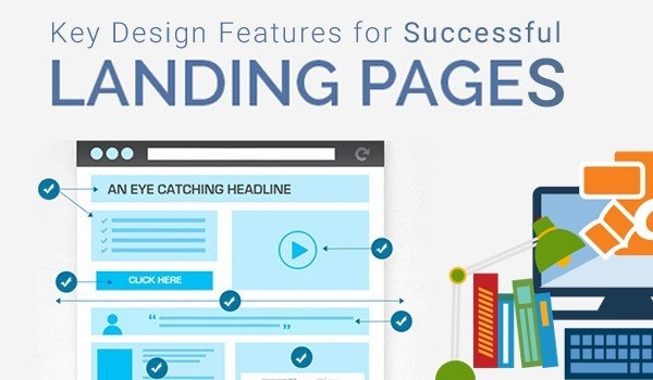
So what makes a good landing page? Here are the basics:
- Targeted messaging with a singular focus: to drive one particular conversion action from the visitor
- Short-and-sweet (and powerful) headlines and copy that illustrate what’s on offer, why it’s valuable, and why visitors should believe you
- Minimalist layout, design, and links so that visitors don’t get distracted and click away from the page without converting
- Clear, eye-catching call-to-action (CTA) buttons that lead users to the conversion, like filling out a form or making a purchase
Keep in mind that these are general best practices for landing pages. You don’t need to follow all of them all the time.
Let’s look at some of the best landing page examples that illustrate these principles – and a few rebels that break the rules.
7 Best Landing Page Examples
1. One Page Love
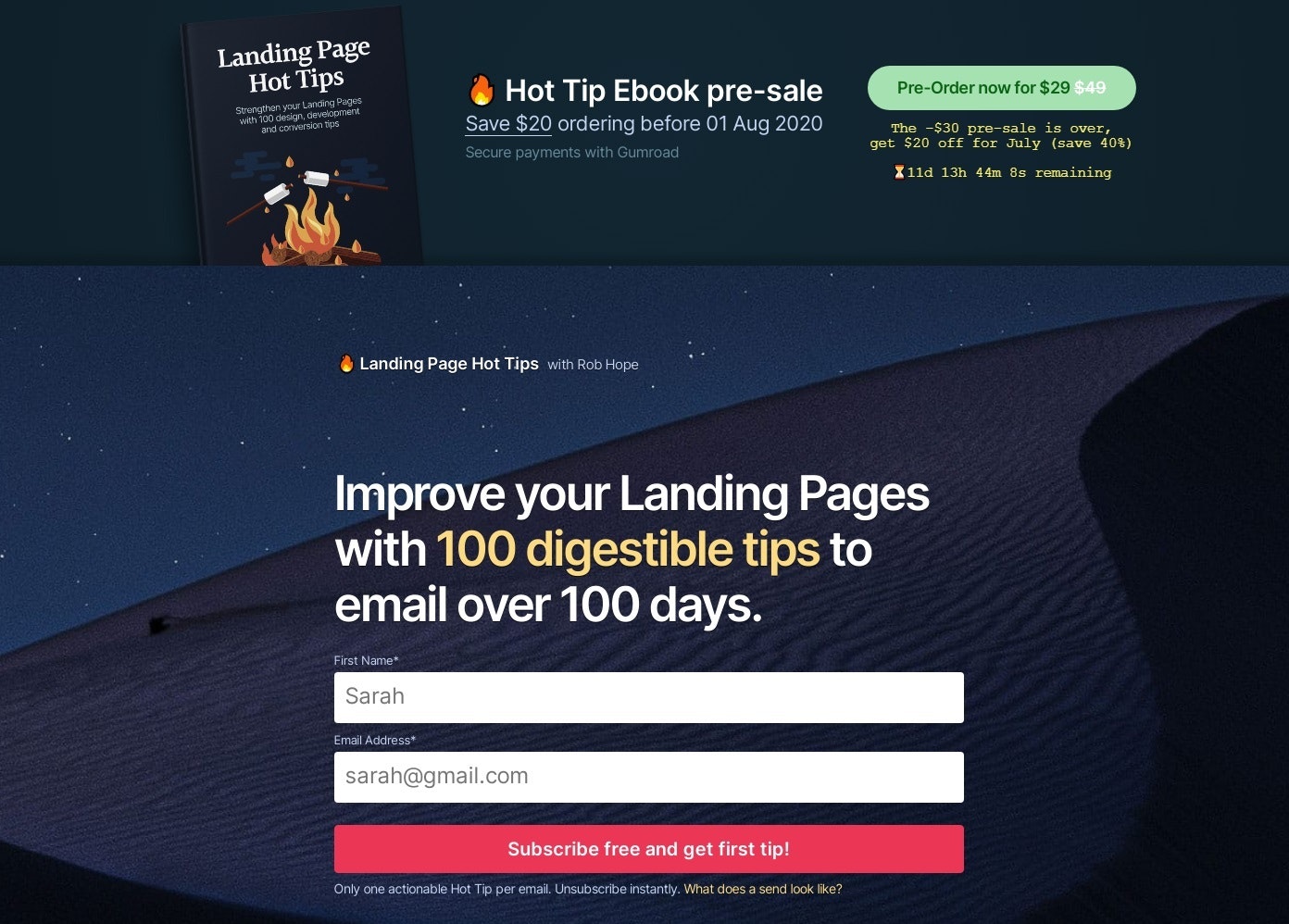
This landing page from One Page Love has a clever tactic to lead to the sale of their ebook “Landing Page Hot Tips.”
In the top banner, you can see a callout for a pre-sale of the book.
It gives visitors a sense of urgency and FOMO by saying that the $30 off pre-sale is over, but they can still get $20 off for the rest of the month.
The magic here is what happens next: for those who are interested but not quite sold yet, they can sign up to receive one tip via email per day over the course of 100 days.
This gives just the right amount of commitment and gives visitors the opportunity to “try before they buy.” And if they like the first handful of emails, they’ll buy the book instead of waiting for more than three months to get all the tips.
Genius.
Under the signup form, they include a few testimonials from customers, which serves as social proof that the tips are actually good. Below that is a sample of what an email looks like.
One Page Love does an excellent job of creating appeal and urgency for visitors to buy the book or take its content for a test run.
2. Shopify
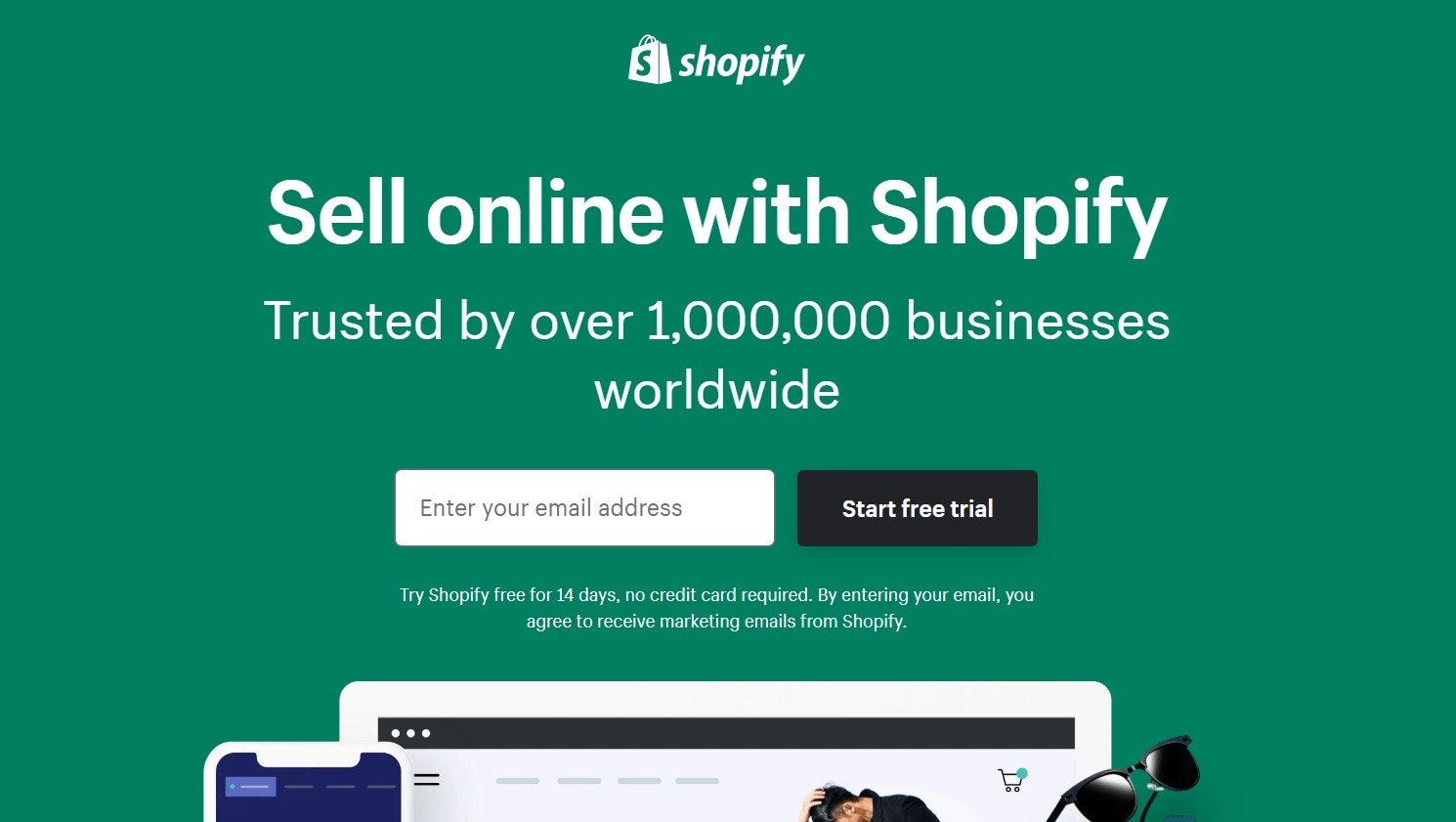
Shopify’s free trial landing page is on a mission to get you to sign up.
True to landing page best practices, there’s just one CTA button the whole page: “Start free trial.” This shows up once in the hero and then again at the very bottom.
The double CTA is an effective strategy. It’s clear and simple at the very top of the page for visitors who are ready to go.
But for those who need some more convincing, they can scroll through and see Shopify’s selling points. Once they get to the bottom, they’re reminded of the sole purpose of this page and given the opportunity to sign up without having to scroll back up.
This speaks to a key element of all the best landing pages: it’s easy for a visitor to convert. With every extra scroll or click, you’re adding another opportunity to lose the conversion.
Consider this tactic on your landing pages… you’ll be surprised how many people click the bottom button!
3. Fitbit
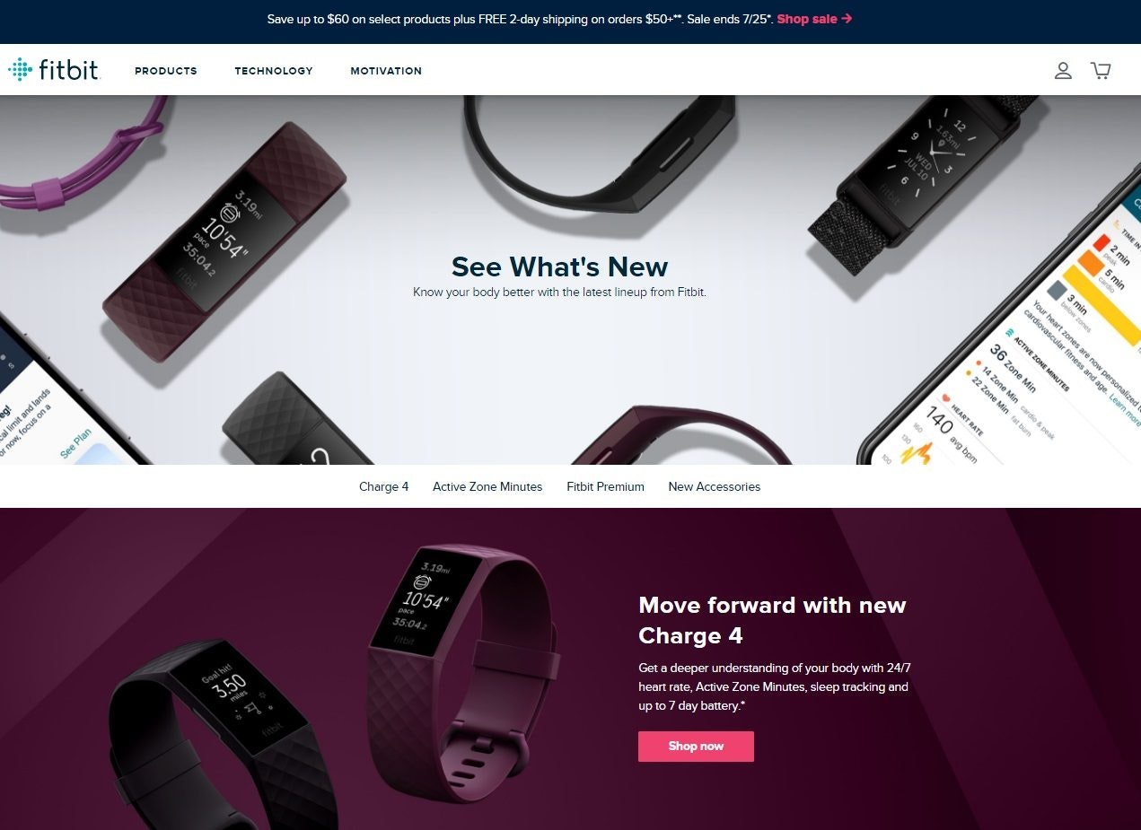
Typically, the best landing page examples follow the cardinal rule of only having one CTA button or link.
But some rules can be broken.
Fitbit’s “What’s New” landing page is a great example of this. The umbrella CTA is to learn more about what’s new, with the opportunity to click through to learn more about what specific new items each visitor is interested in.
It starts with a big, beautiful hero image of some of their products. Under that, there’s a clickable menu showing the four main sections of the page.
As you work your way down the page, each section uses attention-grabbing visual techniques like:
- Bold, distinct separation of colors and images between sections
- Negative space, or blank space around the object of focus, which draws the visitor’s eye to the star of the photo
- Lifestyle photography, which shows people using Fitbit’s products in action
Each image is accompanied by a short headline and a single-sentence description, which keeps the page from becoming too cluttered or distracting.
Even despite the several CTAs, Fitbit guides visitors through a streamlined experience to teach them all about what’s new.
4. Mixpanel
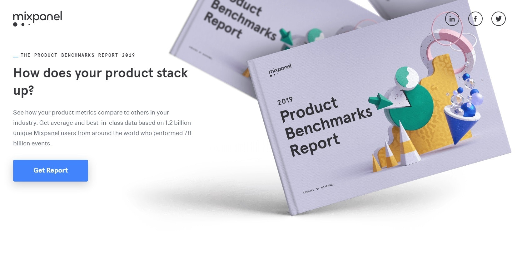
Mixpanel has a fun and creative landing page example for users to download their free ebook.
This lead generation technique can help you collect email addresses of interested people, who you can nurture through email marketing campaigns and other strategies in your sales funnel.
The page uses negative space to draw attention to the image in the hero. This ebook is the star of the show. Mixpanel created a physical book graphic even though it’s an ebook – a technique that makes the offering more tangible and easy to visualize.
The ebook cover is white with a pop of colors in the abstract images, which draws attention while still keeping it classy.
Below, there’s a social proof in the form of past clients like Clorox and US Bank.
Then there’s a summary of what information you’ll get inside the book.
There are three CTA buttons on the page: the first two are anchored to the bottom of the page, meaning that when you click them, your screen automatically scrolls down to the bottom. This is where the form is to fill out your info and get access to the book.
This page follows the practices of some of the best converting landing pages:
- Clean design with just the right attention-grabbers
- Several opportunities to get visitors to the main action you want them to perform
- The right amount of information to convince visitors that this offer is legit, trusted, and contains valuable content
5. Winc
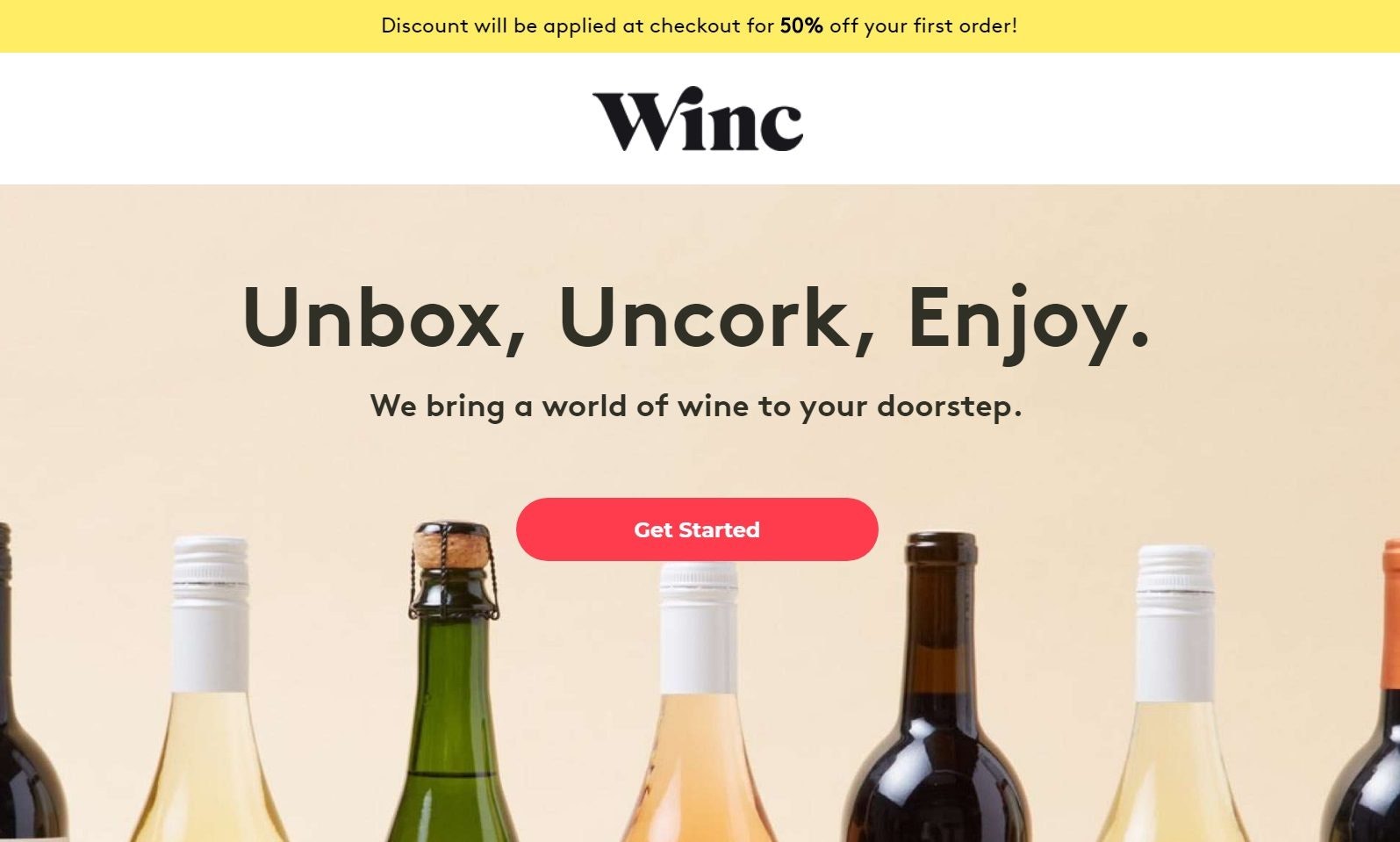
Winc winery has one of the best ecommerce landing pages when it comes to simplicity.
This page starts with an appealing offer: 50 percent off your first order. And you don’t even have to do anything – it’s applied automatically.
Score a few points for simplifying the user experience.
The simple three-word headline “Unbox, Uncork, Enjoy” is coupled with the sub-headline “We bring a world of wine to your doorstep.” These two work together to paint a picture of the ease and simplicity you’ll get when you buy from Winc.
Below the hero, there are three simple selling points that drive home their main value proposition: they’ll learn your palate and curate wine boxes just for you.
Winc wraps up the page with a powerful endorsement from Forbes that says “The proof is in the bottle.”
There are two identical CTA buttons on the page, both of which lead you to the first step of their sales process: a six-question quiz to get a feel for your palate.
What’s cool about this is that they explain what each question means. For example, the first question asks how you take your coffee, which indicates your preference for the bitter-tasting tannins in red wines.
6. Home Chef
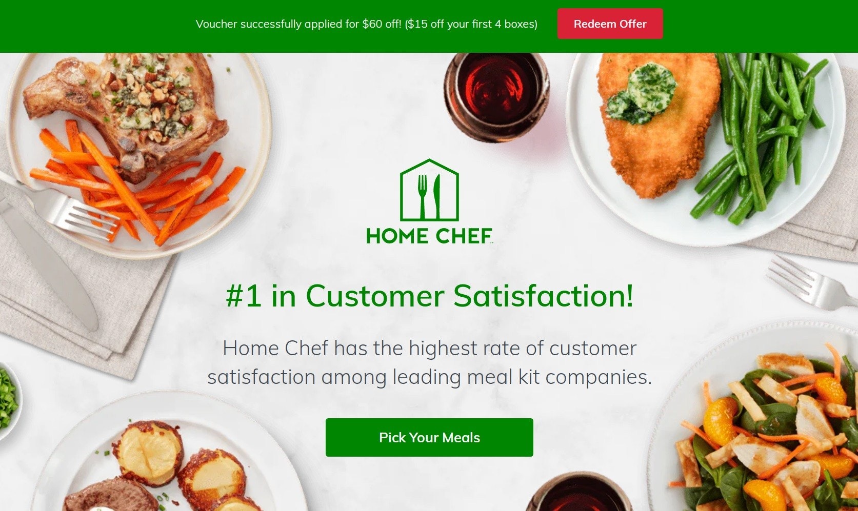
Meal delivery company Home Chef snags in users right off the bat: a banner at the top of the page offers a tasty $60 discount on your first four meal boxes.
This page uses heavy branding to lead you to the sale. The logo is front-and-center in the hero, along with the proud proclamation that they’re rated #1 in customer satisfaction among their competitors.
(Unfortunately, this is an empty claim because they don’t offer any research or info to back it up. I recommend that you avoid making unfounded claims on your own landing pages.)
But Home Chef follows up with earnest transparency in the next section. The headline reads “Why We Think You Should Try Home Chef.”
It goes on to list flexibility, variety, and value as its three value propositions. And for anyone exploring a meal delivery service, these are pretty much the three defining factors for making the choice.
Home Chef wraps up this ecommerce landing page example with a short testimonial video from a young couple, and the same “Pick Your Meals” CTA as the hero.
7. Crazy Egg
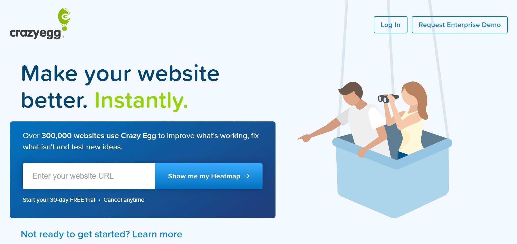
Crazy Egg is one of the best converting landing pages I’ve seen. This makes sense – the service is aimed at helping its customers increase their website performance and conversion rates.
When you land on the homepage, there’s no content under the hero. You just have a few options. One is to enter your website URL so it can show you a heatmap, which shows you what parts of your webpages your visitors are clicking (and therefore most interested in).
Underneath the main CTA is secondary CTA: “Not ready to get started? Learn more.”
Clicking this expands the rest of the landing page with helpful information about what Crazy Egg does and how it can benefit you.
Instead of talking about the company and boasting its capabilities, Crazy Egg focuses on the “what’s in it for you” (WIIFY). This helps visitors to make a connection and visualize how the product fits into their needs and goals.
Under the hero, there are a few sections that all have the same CTA: “Start by analyzing your website.” This leads you back to the top section to get your heatmap.
This landing page has one clear goal with several opportunities to guide visitors to the conversion.
It’s succinct, effective, and does a great job of showcasing the product without losing focus of their potential customers.
Take notes!
More Tips for Awesome Landing Pages
Keep these extra tips in mind as you build your awesome landing pages:
- Make sure they’re mobile friendly. This goes for every single page of your website. As of 2019, 53 percent of all web traffic came from mobile devices. Don’t leave those visitors out of your plan.
- If your landing page uses forms, try to minimize the number of fields they need to fill out. One company cut its form down from 11 fields to four and saw a 120 percent increase in conversions.
- Everyone loves video, so use a video on your landing pages if you can. Even better if you can make your own versus using someone else’s. One study shows that including videos can boost your conversions by up to 86 percent.
Killer Landing Pages to Grab Attention and Get Conversions
As you can see, there’s no single right way to make a landing page. The best landing page examples all follow a general list of best practices, but you have a lot of opportunities to get creative.
The name of the game is really understanding your customers. When you know what really matters to them and how to communicate that in their own language, you’ll be able to win them over time after time.
Just remember: all awesome landing pages have clear and direct messaging coupled with a smooth and streamlined user experience.
Once you’ve got that down, you’ve already won half the battle.
